Brand Design Elements: The Silent Positioning Signal
Every founder spends weeks crafting the perfect brand message. Then they unknowingly contradict it with their color palette. Brand design elements (color psychology, visual hierarchy, and typography) function as a non-verbal language that either reinforces your positioning or silently argues against it. This article delivers a practical audit framework you can apply to your own brand today to find and close that gap.
The problem isn't that founders don't care about design. It's that most founders treat design as decoration rather than communication. When those two systems, your words and your visuals, send conflicting signals, your audience resolves the contradiction by choosing not to trust you. They rarely know why. They just move on.
Closing that gap allows your brand to start doing its job before you say a word. You need diagnostic tools to recognize this failure and build a stronger system.
Why Brand Design Is a Language System, Not an Art Form
The moment you treat brand design as an aesthetic choice, you step away from one of the most powerful positioning levers available to you. You hand strategic control to personal preference.
Research from the Institute for Color Research shows that people form a subconscious judgment about a product within 90 seconds of initial viewing, and up to 90% of that assessment is based on color alone. Color isn't decoration. It's the first data point your audience receives.
Every design decision, from the weight of your headline font to the whitespace on your homepage and the specific shade in your logo, transmits a signal. That signal is received before your audience reads a single word of copy.
Design operates as a communication system with its own grammar. When your words say "premium, trustworthy, expert" but your visual language says "DIY, generic, unclear," your audience feels the contradiction even when they can't name it. They simply don't trust you. They walk away without knowing why.
Understanding brand design elements as a language system is the shift that separates founders who build positioning that compounds from those perpetually wondering why their marketing isn't working. [LINK: brand positioning strategy]
The Myth of Subjective Design
Subjectivity fails under scrutiny. Color psychology, typographic conventions, and visual hierarchy are not matters of personal preference. They are documented, studied response patterns in human perception that operate with measurable consistency across audiences.
A study published in the Journal of Business Research found that color increases brand recognition by up to 80%. That number is not an opinion. It is a measured cognitive response replicated across market research.
Subjectivity exists in aesthetic preference: whether you personally like a design. But strategic effectiveness (whether a design communicates the correct positioning to the correct audience) is entirely measurable. Treating design as subjective is the equivalent of treating words as subjective. Both are tools. Both have precise applications. Both can be deployed skillfully or carelessly. The consequences are real either way. So is the opportunity.
Color Psychology: The Brand Design Element That Positions Fastest
Color is the fastest non-verbal positioning signal in your brand system. It works before the eye can read, before the mind can evaluate, and before the audience can consciously process what they're experiencing.
The strategic choice focuses on the emotional and psychological response a color triggers, and whether that response aligns with your positioning statement.
Consider this direct mapping. A leadership consulting firm positioned as "the most exclusive strategic partner for seven-figure founders" selects deep navy and matte gold. The navy signals authority, depth, and trustworthiness, consistent with decades of research showing blue carries associations of expertise and reliability across Western markets [LINK: color psychology research]. The gold signals premium access and earned status. Together, those brand design elements create a visual positioning statement that confirms every word in the verbal strategy.
Now place that same firm in bright turquoise and coral. Both colors are excellent. They work perfectly for a wellness brand or a consumer lifestyle company. But against a positioning built on exclusivity and strategic authority, those colors introduce contradiction. Playful energy fights serious expertise. The audience receives a mixed signal and defaults to confusion.
According to a study by Colorcom, consumers decide whether or not they like a product within 90 seconds of initial viewing, and color influences between 62 and 90 percent of that snap assessment. That is not design theory. That is competitive real estate you can choose to own. Alternatively, you can leave it on the table.
The Mechanism Behind Color Psychology
Color psychology affects brand perception by triggering documented emotional and cognitive associations before rational evaluation begins. Red accelerates physiological arousal and signals urgency or passion. Blue builds trust and communicates stability. Green evokes growth, permission, and health. Black projects authority, exclusivity, and control.
These associations are not universal absolutes (cultural and category context matter) but within a specific market and audience, they are predictable enough to serve as strategic tools rather than guesses.
The diagnostic framework is straightforward: identify the single most important emotional response your positioning needs to trigger in your primary buyer, then verify your primary brand color actively supports that response. Where there's a mismatch, you've found a silent contradiction costing you trust at the speed of first impressions. You also gain the clarity to fix it.
Common color-to-positioning mismatches that undermine brand design elements:
- Positioning: "Innovative tech leader" + Color palette: Beige and brown = contradiction
- Positioning: "Safe, trusted financial partner" + Color palette: Aggressive orange = contradiction
- Positioning: "High-end, exclusive service" + Color palette: Neon yellow = contradiction
- Positioning: "Approachable, community-driven brand" + Color palette: Cold charcoal and black = contradiction
[LINK: brand color strategy guide]
Visual Hierarchy: The Brand Design Signal Most Founders Miss
Visual hierarchy is the order in which the eye moves through a design. It is determined by size, contrast, weight, spacing, and placement. It is also one of the most powerful, and most consistently overlooked, positioning signals in an entire brand system.
Visual hierarchy matters because it communicates priority. What you make largest, highest-contrast, and most visually prominent is what you are telling your audience matters most. That priority statement is transmitted before a single word is consciously processed.
According to the Nielsen Norman Group, users spend approximately 57% of their page-viewing time above the fold, and 74% of total viewing time occurs in the first two screenfuls of content [LINK: Nielsen Norman Group UX research]. When your visual hierarchy leads with your strongest positioning signal in those first two screenfuls, you're winning the positioning conversation before a prospect consciously begins it.
Visual Hierarchy and Customer Perception
Visual hierarchy communicates what your brand considers most important, and by extension, whether you understand what your customer is actually looking for. A homepage that leads with your company name in the largest font tells your audience: "We think we matter most." A homepage that leads with the transformation your customer gains tells them: "We understand you."
For founders, this has a direct strategic application: your visual hierarchy should mirror your positioning priorities, not your internal organizational structure.
If your verbal positioning states "we help founders build authority that compounds," then the most visually dominant element on your homepage should express that transformation, not your logo, service menu, or generic lifestyle photograph.
Consider what a visitor remembers if they view your homepage for three seconds and look away. If that one thing does not align with your core positioning statement, your visual hierarchy is creating a silent contradiction. You now have the tools to change it.
Visual hierarchy audit checklist for brand design elements:
- What is the largest element on your homepage? Does it express your positioning or your ego?
- What has the highest contrast? Does it draw attention to your most important message?
- Is there a clear visual path, or does the eye wander without direction?
- Does the hierarchy break on mobile in a way that disrupts your positioning message entirely?
[LINK: website conversion optimization]
Typography Choices in Brand Design Signal Strategic Intent
Typography is personality made visible. The typeface you select, including its weight, structure, historical associations, and spatial rhythm, broadcasts a positioning signal that operates almost entirely below conscious awareness for most audiences.
Serif typefaces carry centuries of association with tradition, authority, and established expertise. They communicate: "We have roots. We have credibility built over time." That is why legacy law firms, prestigious universities, and established financial institutions overwhelmingly use serif typefaces as core brand design elements. The visual language reinforces the verbal positioning claim of earned trust. [LINK: typography brand research]
Sans-serif typefaces signal modernity, clarity, and forward momentum. They communicate: "We are efficient, current, and unencumbered by tradition." That is the visual language of technology companies, innovation-driven brands, and progressive service firms.
Research from the MIT Media Lab confirms that typeface choices measurably influence audience perceptions of trustworthiness, expertise, and brand quality, independent of the actual words being set in that typeface. The container shapes how the content is received.
Typography as Brand Personality
Typography communicates brand personality, positioning register, and perceived trustworthiness before a single word is consciously read. A professional services firm using Comic Sans, regardless of the sophistication of their copy, triggers an immediate trust deficit because the typeface contradicts the implicit positioning claim of professional expertise.
The strategic principle: your typography should match the emotional register of your positioning statement. They should feel like they belong to the same brand.
- Positioning: "Authoritative expert" → Directional choice: Classic serif with strong weight contrast
- Positioning: "Modern innovator" → Directional choice: Clean geometric sans-serif
- Positioning: "Approachable strategic guide" → Directional choice: Rounded sans-serif with generous line spacing
- Positioning: "Premium, exclusive" → Directional choice: High-contrast editorial serif with abundant whitespace
The typography consistency test: Read your positioning statement aloud. Then look at your typeface. Does the visual feeling of that font match the emotional register of those words? When they belong to the same brand, your audience feels it instantly. When they don't, your audience feels that too. They don't always know why they hesitate.
[LINK: brand typography guide]
The Silent Contradiction: When Brand Design Argues Against Your Words
When a brand looks good but fails to convert, the verbal strategy and the visual language are usually in conflict. The audience resolves that conflict by choosing not to trust.
When your words say "premium" but your brand design elements say "budget," the audience does not split the difference and land on "mid-range." They discount the verbal claim and believe the visual one. Design wins that argument every single time.
According to Stanford's Web Credibility Research Group, 75% of users admit to making credibility judgments about a company based solely on its website design [LINK: Stanford web credibility research]. That judgment is formed before they have read your headline. Your visual language is your first impression. It sets the frame through which all your copy will be interpreted.
This is the silent contradiction in its most damaging form: your words make a positioning claim, and your design either confirms or refutes it. Audiences run this consistency check subconsciously at all times. When the signals misalign, the brand simply feels "off." That feeling ends the relationship before it begins.
Identifying Brand Design Contradictions
You can identify a brand design contradiction by running a clean perception test: ask someone entirely unfamiliar with your brand to describe what type of company they think you are based only on your visual design (colors, fonts, layout, imagery) before reading any copy. Then compare that description to your actual positioning statement.
If the gap is significant, you've found something worth correcting. This is not a minor polish problem. It is a foundational communication gap that no volume of content marketing, paid advertising, or sales technique can bridge at scale. But it is a gap that strategic founders, once they can name it, have the tools to close.
For example, a B2B SaaS founder positions their company as "the most reliable enterprise data solution for compliance-driven industries." Their visual brand uses bright green, informal rounded fonts, and casual illustration-style graphics throughout. The visual language says "consumer startup" and "approachable." The verbal strategy says "enterprise reliability" and "compliance." Compliance officers, the actual buyers, visit the site, feel the mismatch, and move on. The product may be excellent. The contradiction ends the sales conversation before it can start.
[LINK: B2B brand strategy]
The Brand Design Audit Framework: Five Points, One Hour
This five-point diagnostic surfaces silent contradictions in your brand design elements before they cost you another prospect. It takes under an hour and requires nothing more than honesty about what you find.
Step 1: Write your positioning statement in one sentence. Not your tagline. Your actual strategic positioning: who you serve, the specific transformation you deliver, and why you specifically. Keep it to 20 words or fewer. If this proves difficult, the audit will surface symptoms of a deeper strategy opportunity worth addressing.
Step 2: Extract the three core emotional signals in that statement. If your positioning is "trusted strategic partner for growth-stage founders," your emotional signals are trust, expertise, and partnership. Write those three words down. These are your benchmark.
Step 3: Audit your color palette against those signals. Using documented color psychology principles, evaluate whether your primary and secondary brand colors reinforce or contradict your three emotional benchmark signals. Set aside personal preference entirely here. You are not evaluating what you like. You are evaluating what your audience receives.
Step 4: Evaluate your visual hierarchy for positioning alignment. Apply the three-second test described earlier in this piece. Show your homepage cold to someone who has never seen your brand and ask what they think you do. If their answer aligns with your positioning statement, your hierarchy is working. If it does not, identify the dominant visual element and ask why it takes priority over your core message.
Step 5: Run the typography consistency test. Read your positioning statement aloud. Then look at your typeface. Ask: does this font belong to the same brand this statement describes? If the answer is no, or even "possibly not," document the gap explicitly. Vague discomfort is not actionable. A named contradiction is.
What to do with what you find: Every gap you uncover is a silent contradiction actively costing you trust, clarity, and conversion. Prioritize the contradiction with the widest gap first. You do not need a full rebrand to begin correcting this. You need strategic alignment, and alignment starts with knowing precisely where the misalignment lives.
According to McKinsey & Company, organizations with strong, consistent brand presentation across all touchpoints outperform less consistent competitors by up to 20% in both revenue growth and customer acquisition efficiency [LINK: McKinsey brand consistency research]. That is the measurable return on closing the gap between your verbal strategy and your brand design elements.
[LINK: brand audit framework]
Your Brand Design Is a Strategic Asset. Start Treating It Like One.
Design is not decoration. It is strategy made visible. Every color choice, every typeface decision, every hierarchy call is a positioning signal transmitted directly to your audience, whether you intended it or not.
The founders who build positioning that compounds are not the ones with the largest budgets or the most sophisticated agencies. They are the ones who recognize their brand design elements as a communication system with real strategic consequences, and who audit that system with enough clarity to catch contradictions before they become conversion problems.
That future is not reserved for brands with unlimited resources. It is available to every founder willing to treat design as strategy rather than decoration. And it begins with a single honest look at what your brand is already saying.
Three immediate next steps:
- Run the five-point brand design audit outlined above. Do it before your next piece of content goes live, not after.
- Name your single biggest silent contradiction: the one place where your visual language most directly conflicts with your verbal positioning.
- Make one strategic design change grounded in documented psychology rather than aesthetic preference, and measure the effect on audience response over the next 30 days.
Your brand has been saying something without your permission. Now you know how to listen. You can make sure every element says exactly what you mean.
Align your brand design with your positioning. [LINK: Strategy First Visibility brand strategy services] Strategy First Visibility works with founders who are serious about building positioning that compounds, starting with the strategic foundation that makes everything else work.
Snappin Team
Strategy-first marketing insights from the team building Snappin — the AI Marketing Copilot that combines strategy, content creation, and scheduling in one platform.
Try Snappin freeContinue Reading
Strategy-First Positioning: A Framework for Founders
If you've invested months in an agency relationship and still can't articulate what makes your brand genuinely different, that is a positioning problem. That distinction changes everything about how you solve it. The strategy-first positioning framework gives founders a structured path to build real
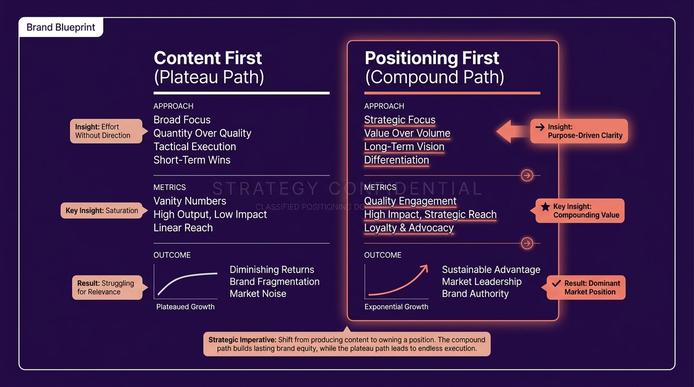
Brand Positioning Before Content: Why Some Brands Compound
Most founders are producing more content than ever and building far less audience trust than they expected. That gap is the predictable result of building in the wrong order, and it closes the moment you change the sequence.

The Mechanics of Reach: A Strategic Guide to Social Media Algorithms
If you want consistent reach, stop looking for "viral hacks." Building a real brand on social media isn't about winning a lottery; it’s about understanding how the platforms actually work.